The Alchemy Attorneys · Case study · Brand Identity & Social Media Content
The Alchemy Attorneys
A law firm that wants you to feel better, not just win.
How we built an identity for a virtual family-law firm with a moral compass, using alchemy instead of scales, columns and gavels.

01 — The problem
Every law firm looks like a courthouse.
The Alchemy Attorneys practise family law out of Texas, fully virtual, built on a pay-it-forward model. Their clients arrive in the worst year of their lives: divorce, custody, a family coming apart.
Legal branding answers that with marble, navy and a pair of scales. It says power and precedent. It doesn't say someone will actually listen to you.
02 — The idea
Alchemy: turning something heavy into something better.
The name already held the brief. Alchemy is transformation, and that is what the firm promises: getting people through litigation changed for the better, not just with a ruling.
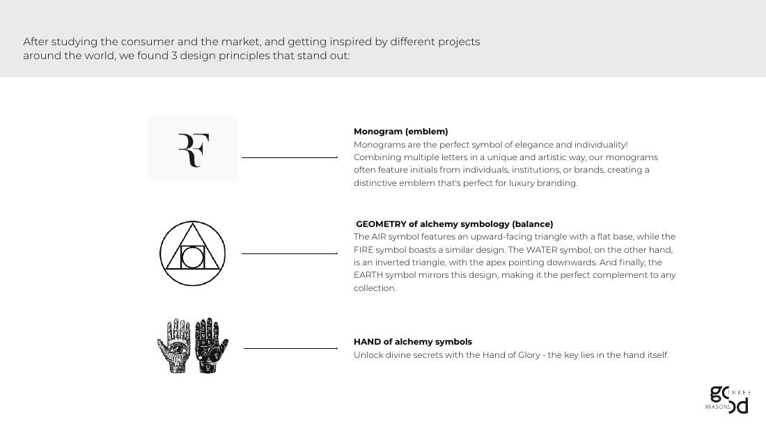
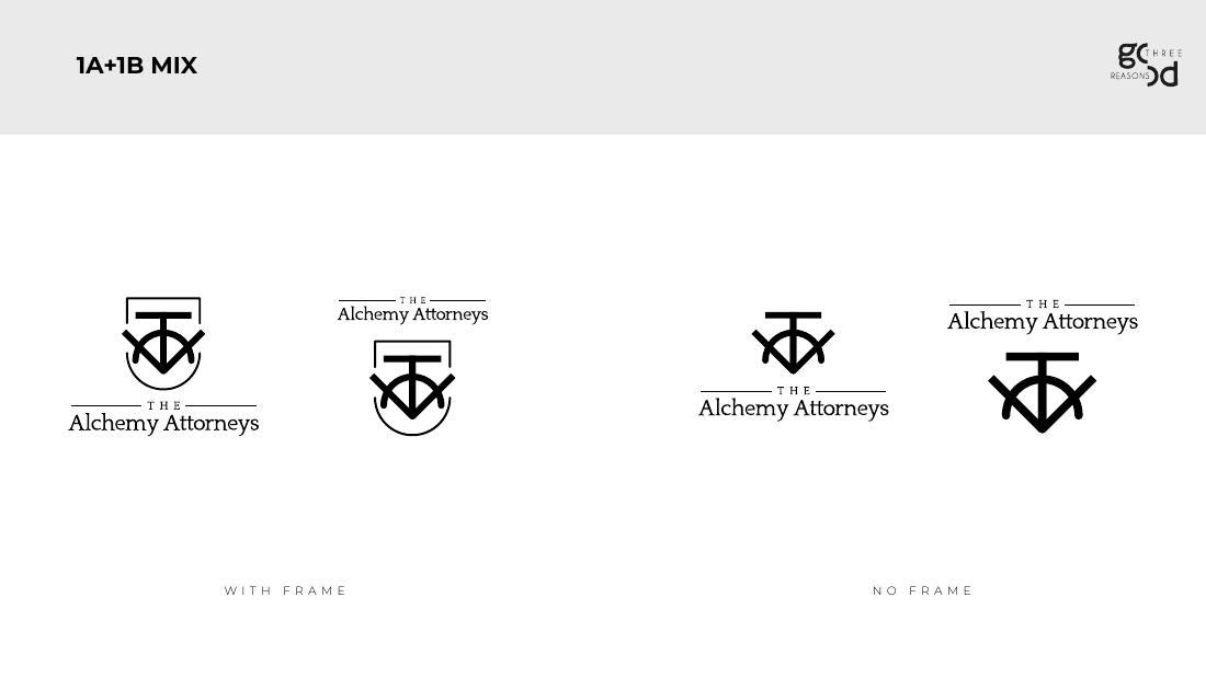
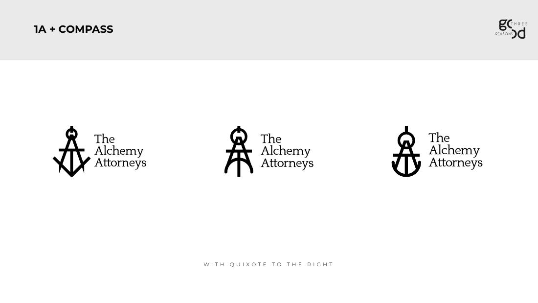
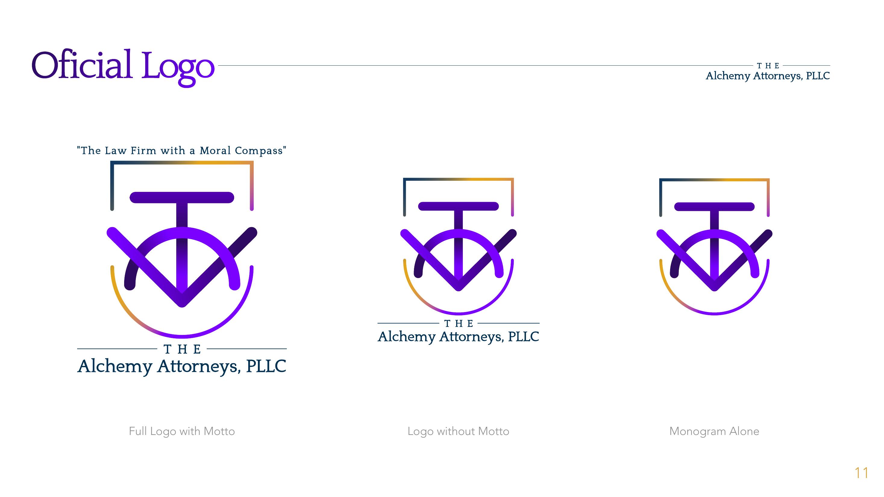
We pulled three principles from it: a monogram for the elegance of a private firm, the balanced geometry of the elemental triangles, and the hand of alchemy symbology. The mark fuses the firm's initials into a single emblem that reads as a sigil and a seal at once.
“The law firm with a moral compass.”
03 — How it works
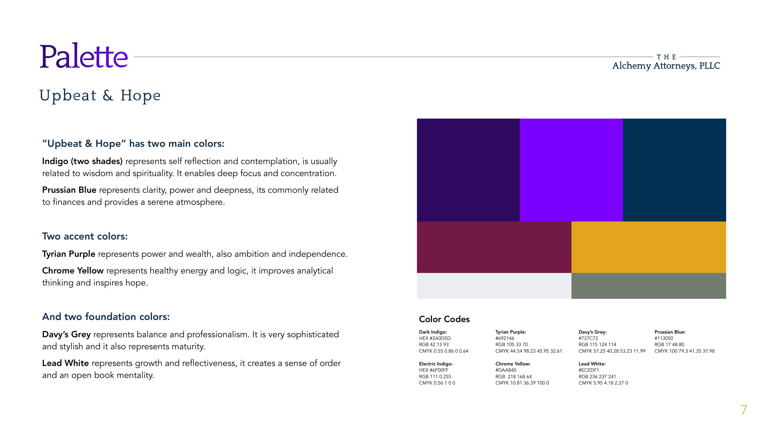
Upbeat & Hope: a palette that doesn't do navy.
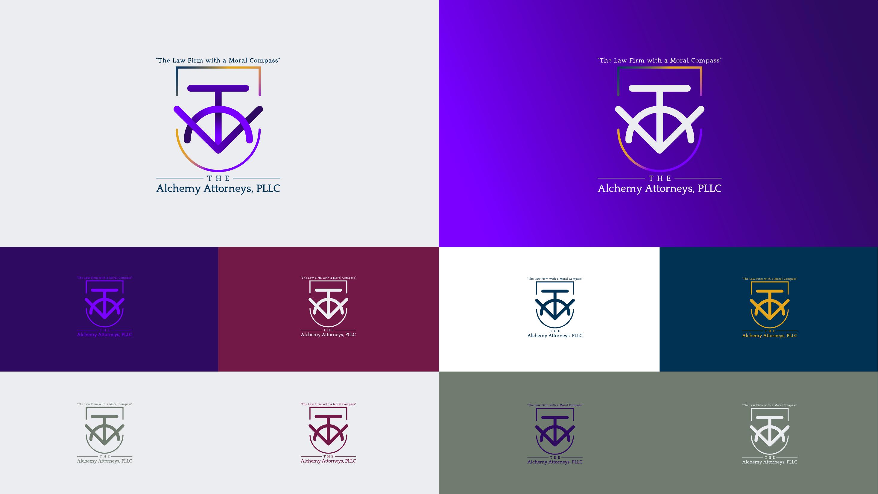
Two indigos lead, for reflection and wisdom, backed by Prussian blue for clarity. Tyrian purple and chrome yellow add ambition and hope; Davy's grey and lead white keep it grounded. Spiritual enough to feel human, serious enough for a courtroom.
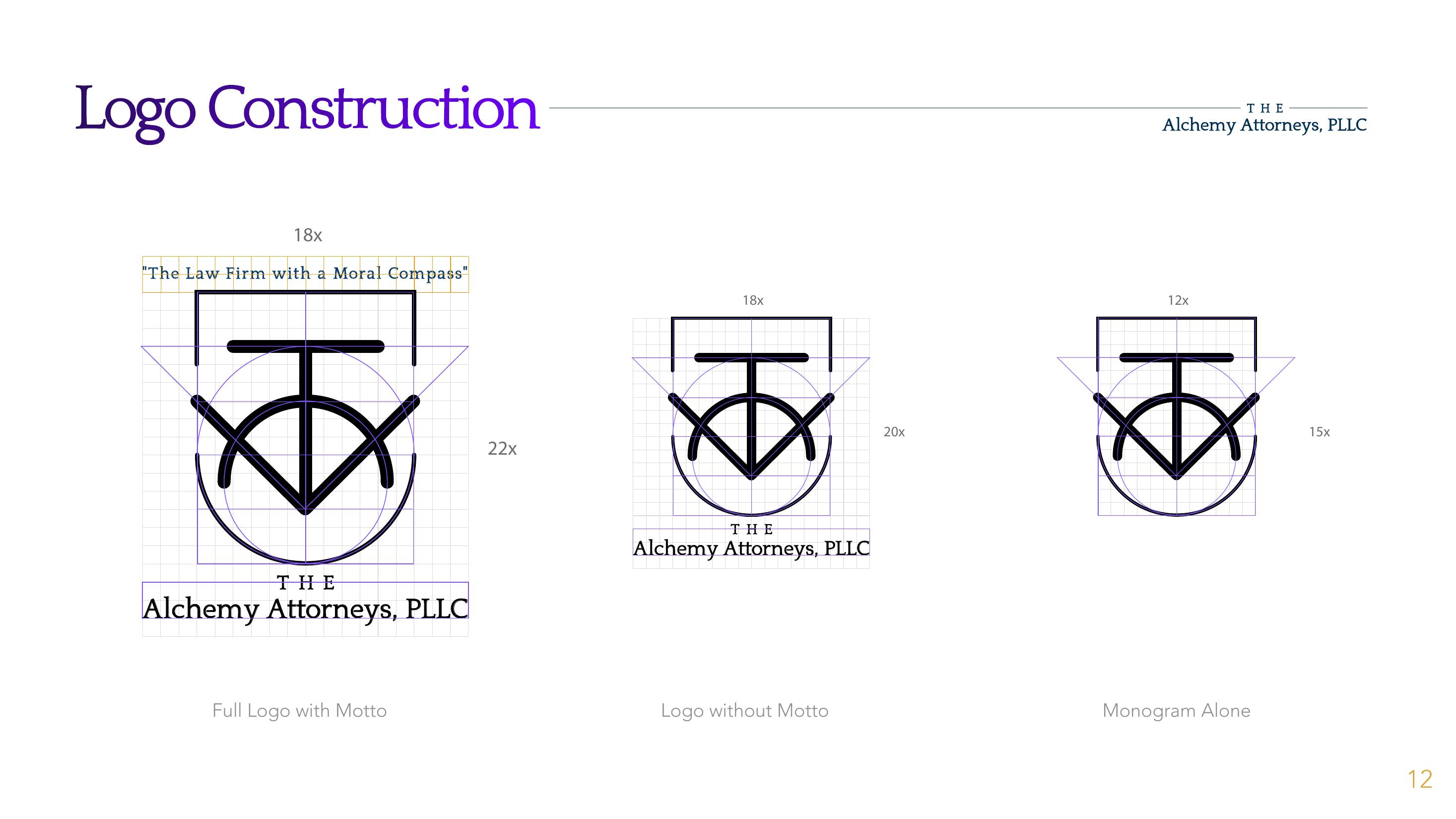
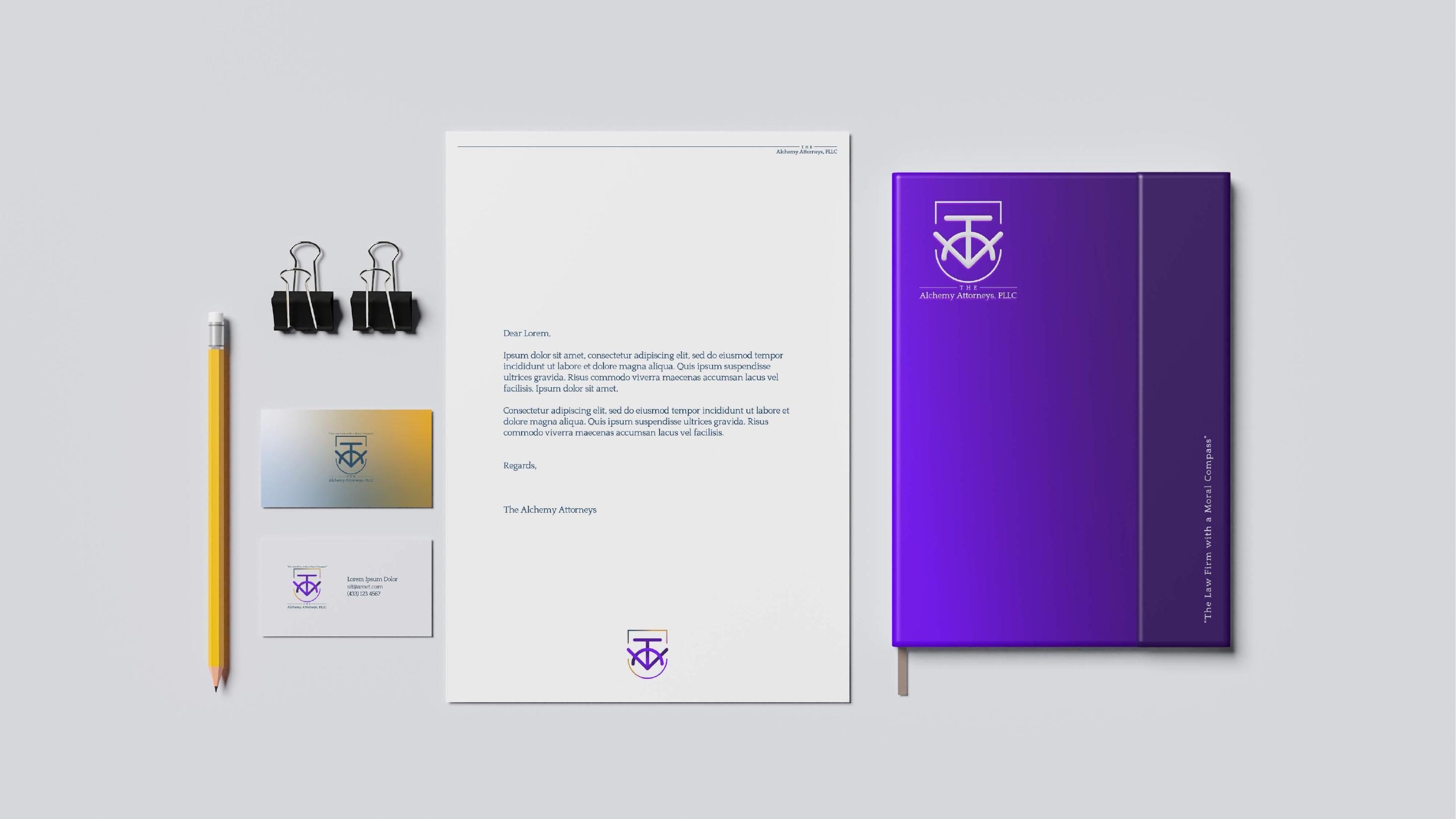
The final mark sits in an open frame that fades from gold to indigo, set in Quixote and built on a strict grid. It comes in three cuts: with the motto, without it, and the monogram alone, so it holds up from a letterhead to a profile picture.
04 — Why it matters
A voice that talks like the firm actually behaves.
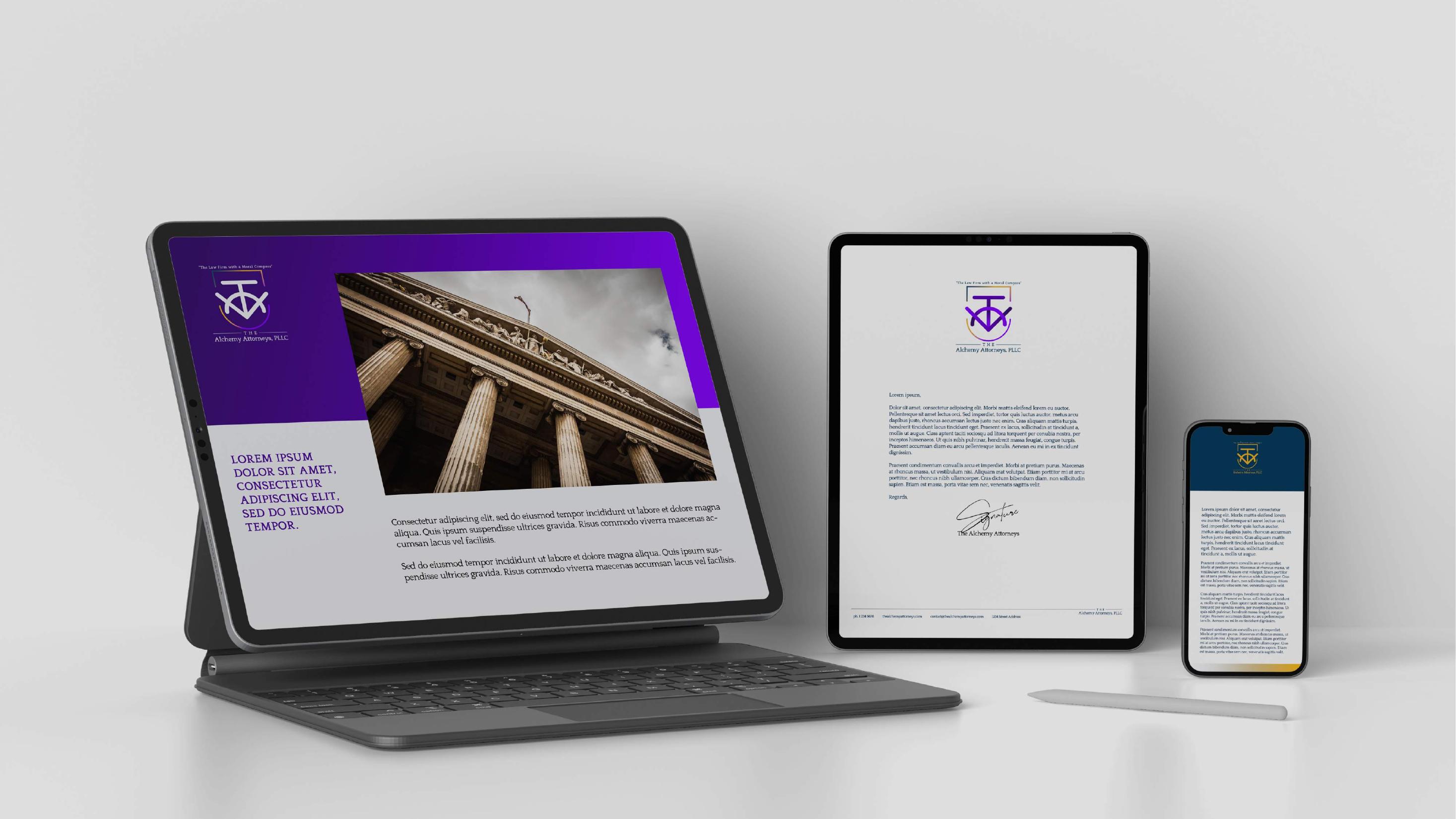
Identity was only half of it. We carried it into stationery, the website, social media and the blog, writing pieces like "Legal Love" about compassion, integrity and dedication, so the firm sounds as warm online as it is with clients.
For a firm whose clients are mostly scared, looking approachable isn't decoration. It's the first sign they came to the right place.
Why it works
Because nobody hires a lawyer to feel worse.
The Alchemy Attorneys look like what they are: serious about the law, and serious about the people going through it.
← Back to all work