ASODI · Case study · Brand Identity System
Design Week Guatemala
A country doesn't need another quetzal on a poster.
How we built the identity of Design Week Guatemala by refusing the postcard and looking at the masters instead.
01 — The problem
The clever ones don't reach for the postcard.
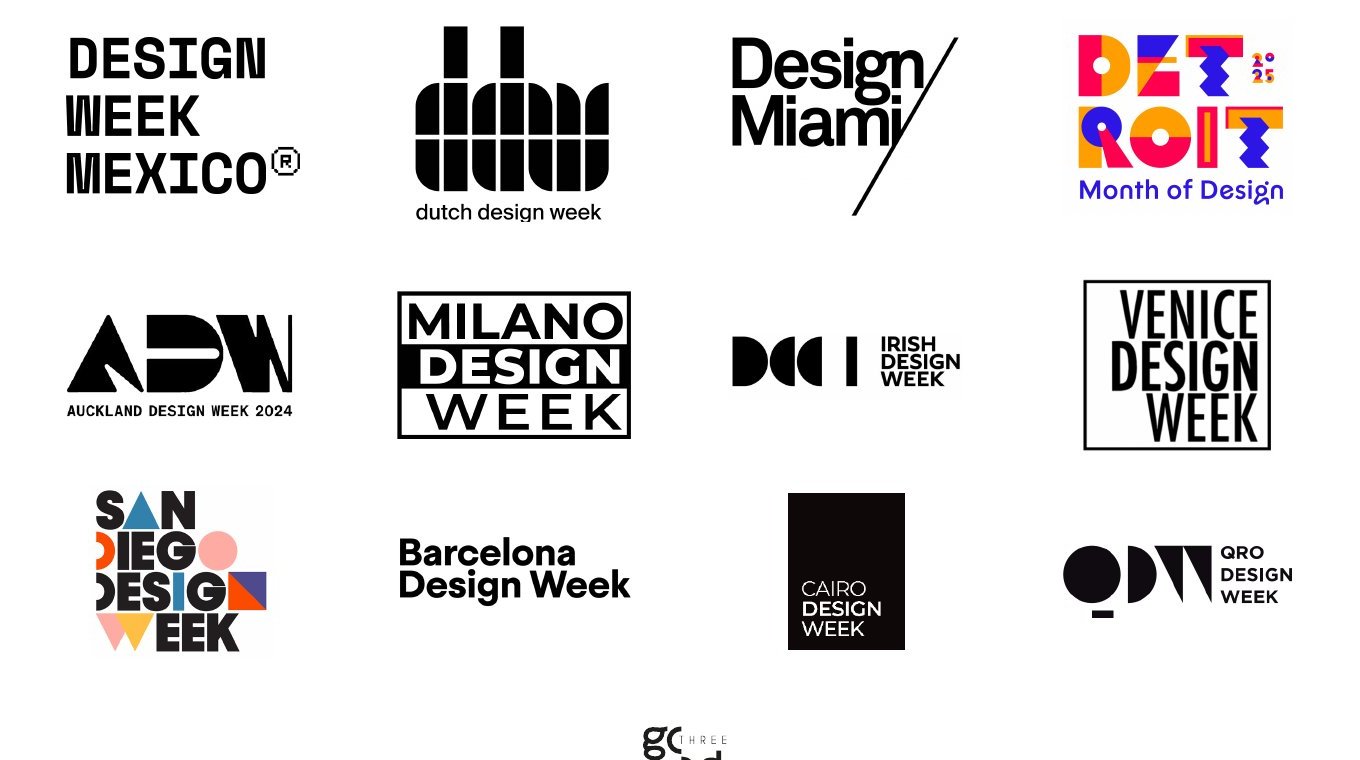
Mexico City, Eindhoven, Miami, Detroit, Auckland, Milan, Venice, Cairo. Line them up and what you notice isn't a formula, it's how much thought went into each one. None of them holds up the souvenir: Milan is a frame, Cairo is a black slab, Detroit is a stack of coloured blocks. The Dutch could have printed a tulip and gotten away with it, and instead they built a monogram that behaves like a modular system. That's the bar. Being local is the hard part, and they all found a way to do it without naming the obvious.
Guatemala's problem was the opposite of a loud one. The quetzal, the huipil, the volcano aren't shouted here — they're worn out. Everyone who has ever tried to say Guatemala has said it exactly that way, for long enough that the symbols stopped being read. Heritage turned into wallpaper: present everywhere, invisible in practice.
So the brief was the difficult one. Not make it local; that version of local was already used up. We needed the Guatemala nobody had claimed yet, and we needed it handled as well as the best marks on this wall.
02 — The insight
Guatemalan design already had a language. Nobody had used it as a system.
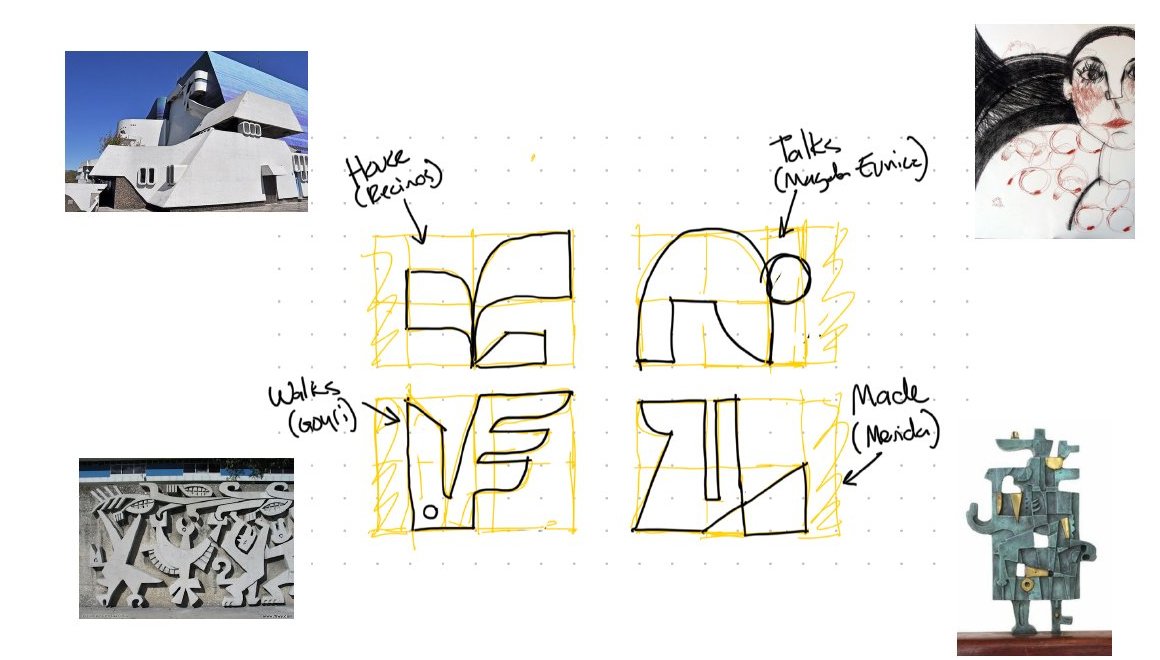
Before Guatemalan design could be modern, it already was. Efraín Recinos turned concrete into sculpture. Magda Eunice Sánchez drew with a line that was tender and brutal at once. Roberto González Goyri carved whole stories into the walls of the city. Carlos Mérida broke the figure into geometry before most of Latin America knew it could be done.
Our insight was simple, and a bit uncomfortable: the most contemporary thing Guatemala could do was look at its own masters instead of looking north.
“Design as active memory: recognising our roots to project a vibrant future.”
03 — The idea
Four masters. Four marks. One week.
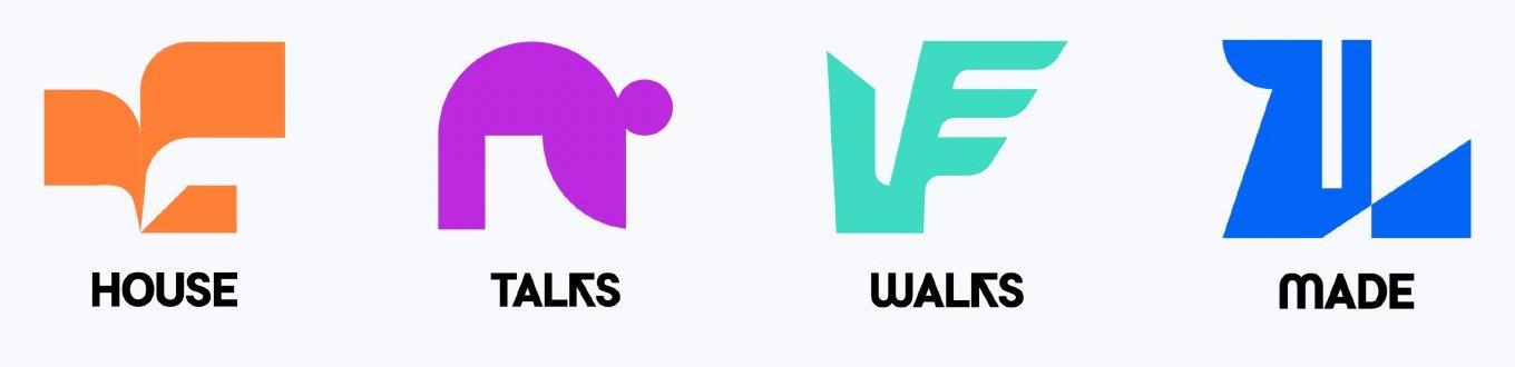
We broke the logo into four glyphs, and each one is a quiet tribute. House comes from the folded volumes of Recinos. Talks comes from the line and the curve of Magda Eunice. Walks comes from Goyri's relief. Made comes from Mérida's stacked geometry.
They aren't illustrations of the artists. They're distilled down to grid, angle and weight until only the attitude is left. Together they spell the brand, and on their own each one names a part of the program: House, Talks, Walks, Made.
04 — Chromatic memory
A palette with a birth certificate.
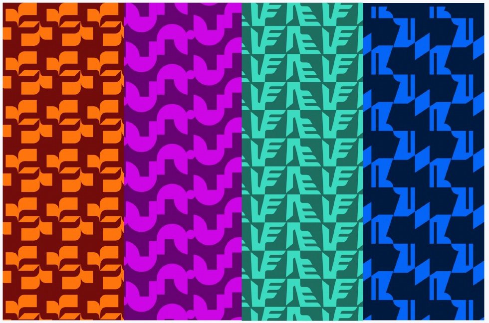
No colour got in because it looked good. Ixchel, the orange, is named for the Maya goddess of creativity. Bugambilia, the magenta, carries the expressive force of contemporary art. Jade is ancestral wisdom. Atitlán is the depth of the lake. Lienzo is the blank space where ideas begin, and Obsidiana is volcanic stone and the contrast that holds it all together.
It's bright, it's loud, it's unapologetic. It's also more Guatemalan than any huipil pattern printed on a tote bag.
05 — In the world
Built to be worn, hung and scrolled.
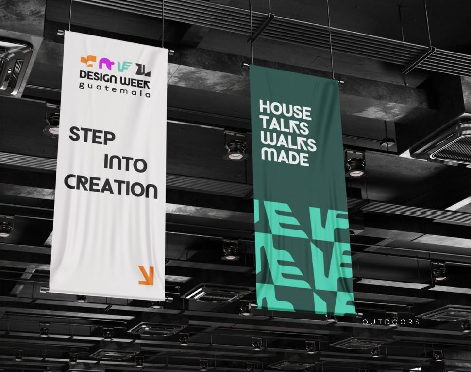
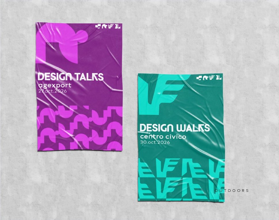
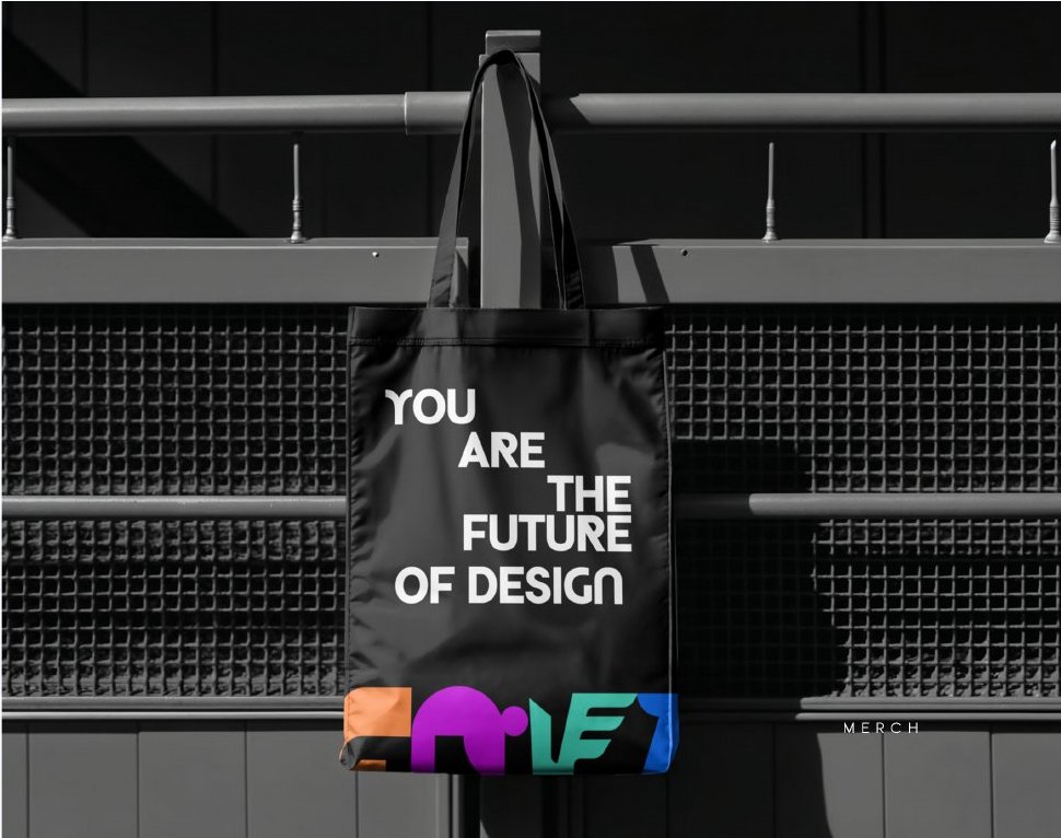
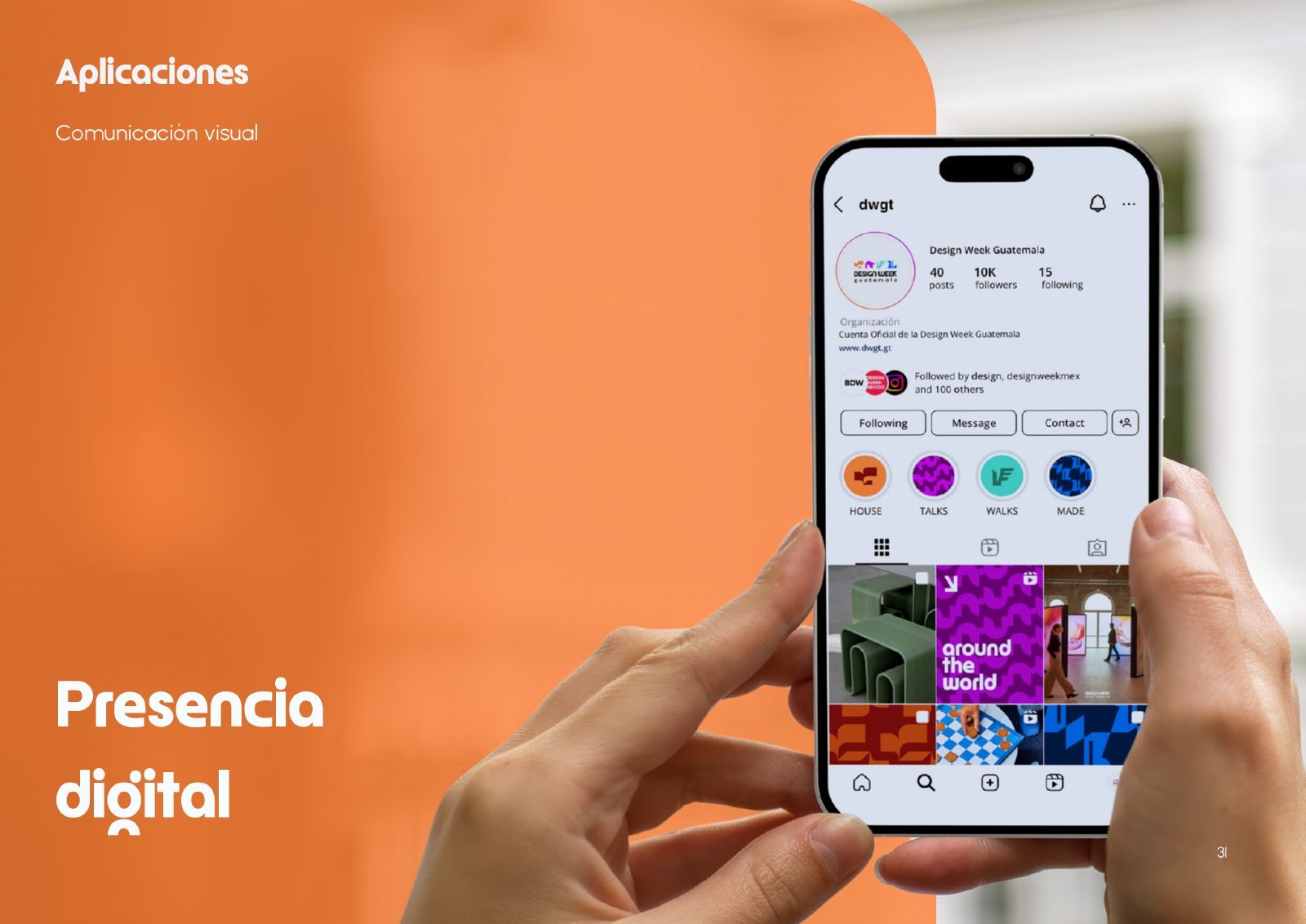
A system is only as good as its worst application. So we pushed it everywhere: banners that read like a manifesto (House, Talks, Walks, Made), event posters, merch people actually want to wear, and a social presence that feels like a design magazine instead of a calendar of events.
Why it's our flagship
Because it proves heritage doesn't have to look old.
Design Week Guatemala sums up how we work. We dig until we find a truth nobody had claimed, then turn it into a system tough enough to live in the real world. No clichés, no imported trends: an identity that could only belong to Guatemala and still holds its own next to Milan.
← Back to all work