Croma Glass · Case study · Brand Identity System
Croma Glass
Glass was never meant to be invisible.
How a small workshop with a new technique became one of the biggest names in custom glass and mirror, and why we stopped being its agency somewhere along the way.
01 — The problem
Nobody talks about glass. They talk through it.
In 2018 Croma came to us with something genuinely new: ways of painting glass and mirror that nobody else in the market was doing. What they didn't have was a way to say it. And the category wasn't going to help them.
Glass is the material everyone uses and nobody looks at. It's sold by the square metre, by thickness, by delivery date. The whole industry talks like a hardware store, because for decades the job of glass was to disappear.
02 — The insight
Croma doesn't sell glass. It sells what happens to light.
We went back to the word. Khroma, in Greek, is colour. In colour theory, chroma is the distance between a colour and the grey of the same lightness: pure saturation.
That gave us the whole brief in a name. Croma is the part of glass that isn't grey. The coloured, overlapping, slightly impossible part that makes an architect stop in the middle of a lobby.
“Somos el croma de los vidrios.”
03 — The idea
Three shapes and the light between them.
We studied what coloured glass actually does in space and kept three principles. Geometry, because glass is cut, not drawn. Overlap, because two tinted panes make a third colour neither one has. Illusion, because mirror and colour love to build geometries that shouldn't exist.
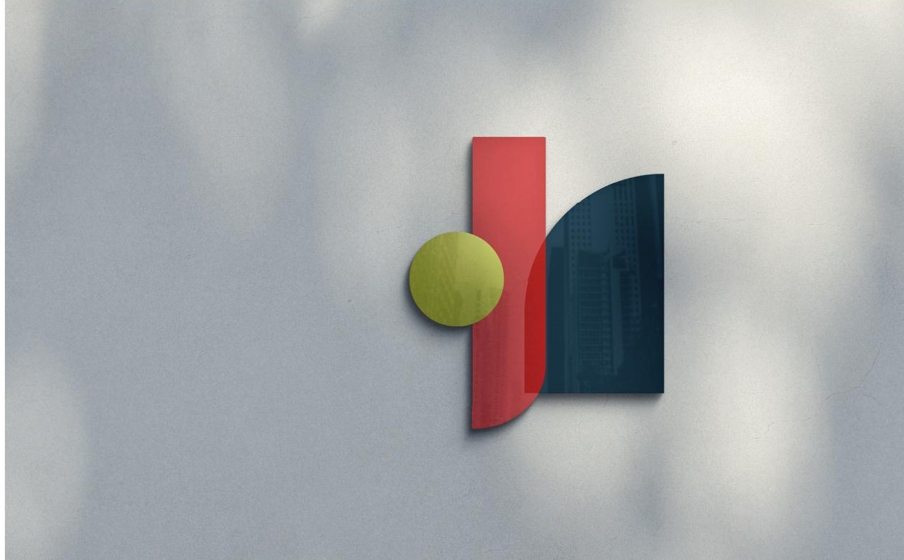
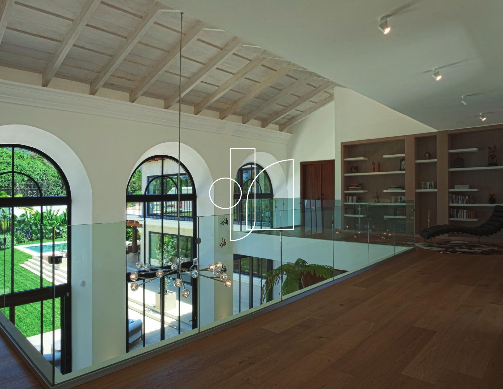
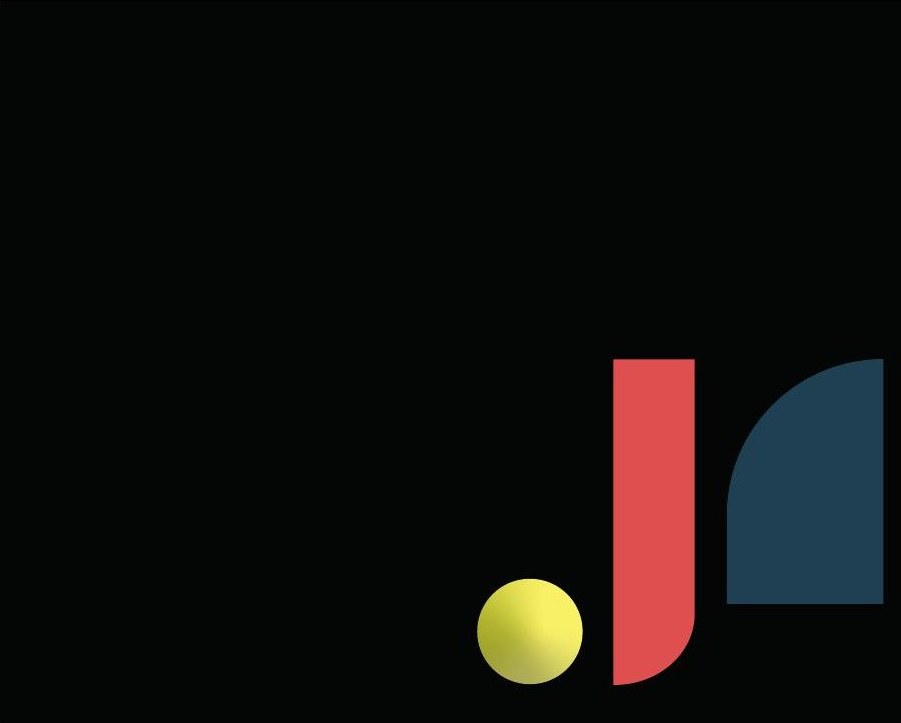
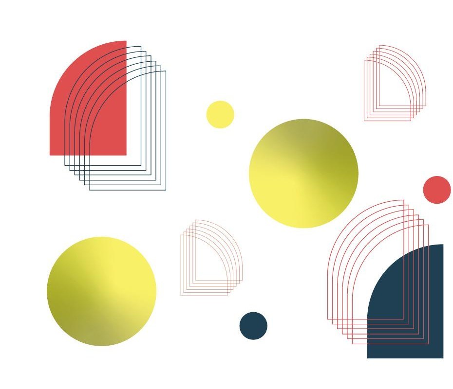
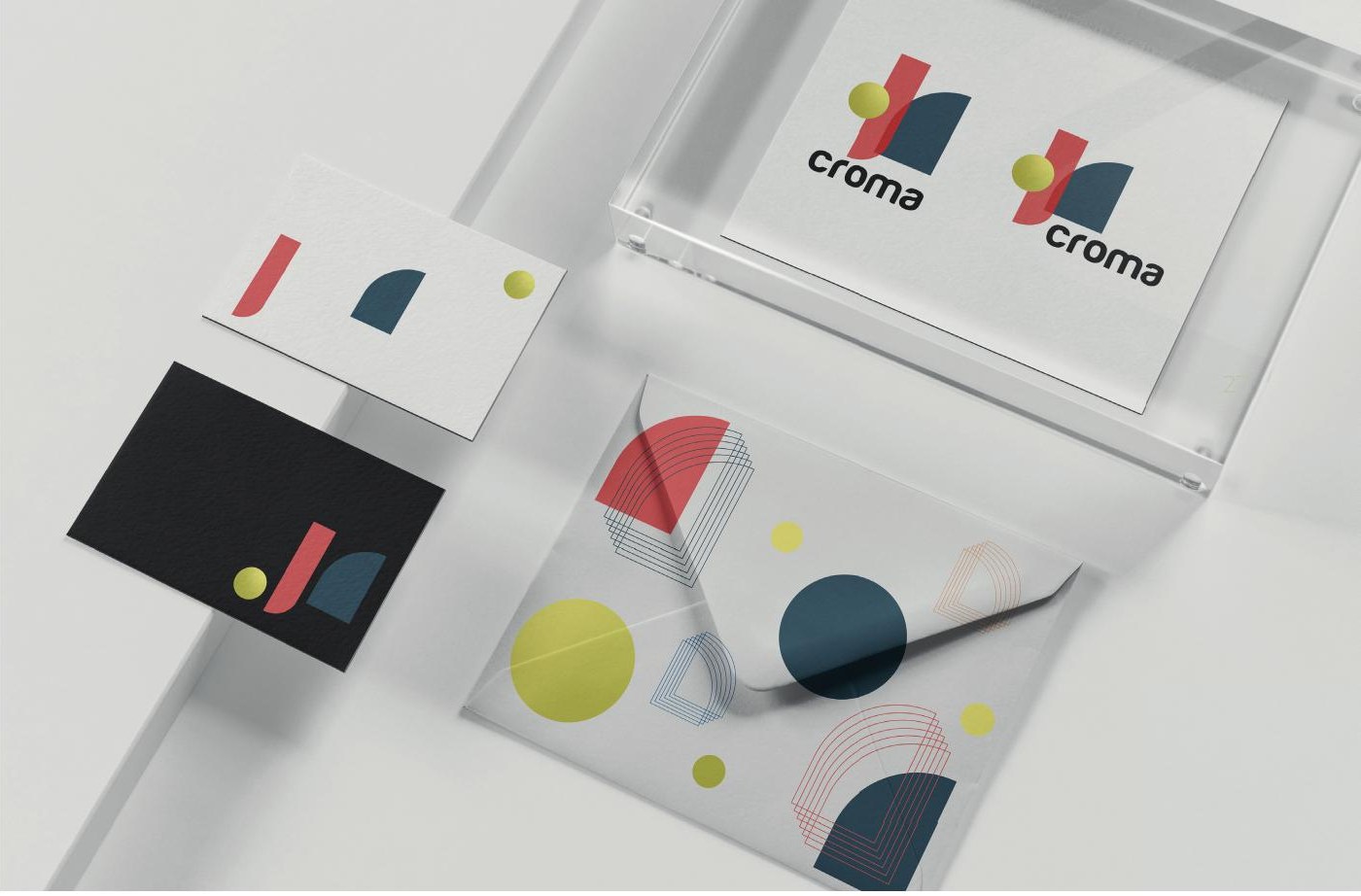
The symbol is those three ideas in their simplest form: a sphere, a straight arch and a half-arch. Where they cross, they behave like glass: the red goes deeper over the blue, the sphere catches light like a lens. It's a logo you could commission from Croma, which is the point.
04 — The spectrum
A palette that moves from warm to cold, like a pane at sunset.
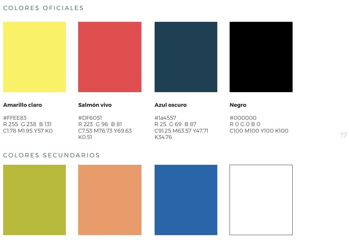
The colours come straight off the colour wheel: a base, its analogue and its contrast, each with a darker tone so the system can shade itself. Light yellow, live salmon and deep blue, held together by black.
Then we let them melt. Gradients do in print what Croma does in a showroom: a surface that changes as you look at it.

05 — The partnership
The best briefs arrived as WhatsApp audios.
An identity is a starting point. What happened next is the part we're proudest of. Over the following years Croma grew into one of the main players, arguably the biggest, in high-ticket custom glass and mirror for interior design, making one-off pieces to the specs of architects and designers.
We grew with them, and somewhere along the way the line between client and supplier stopped making sense. Plenty of what Croma has made started in a meeting, a call or a voice note with tgoodr. Some ideas were theirs, some were ours, most we can't remember whose they were. That's how you know it works.
Installation photo to come
A finished Croma piece on site: colour and mirror in a real interior
Installation photo to come
A second Croma installation, photographed once it is delivered
Why it matters to us
Because the brand made the material visible.
Croma proves something we believe about every brief: the most valuable idea a company has is usually the one its category taught it to hide. We helped Croma say it out loud, then stuck around to keep saying it together.
← Back to all work